
Most businesses treat the services page as a list. Visitors treat it as a decision point. That gap is why so much traffic lands on a services page, scrolls halfway, and leaves without contacting anyone.
Good services page design is not about fancy animation or clever grid work. It is about sequencing information in the order a buyer actually asks questions: What do you do? Is it for someone like me? What does it include? What does it cost? What happens if I reach out?
Below is the structure that works, block by block, with layout patterns for single-service and multi-service businesses, where to put pricing signals, how many calls to action to use, and the mistakes that quietly kill conversions.
What a Services Page Is Actually Supposed to Do
Before touching a wireframe, agree on the three jobs of the page:
- Qualify. Help the right visitor recognise themselves in 5 seconds, and help the wrong one leave quickly (that is a feature, not a loss).
- Explain. Turn an abstract offer into something concrete: deliverables, timeline, process, outcome.
- Convert. Give one obvious next step, repeated at the natural decision moments.
If a design element does not serve one of those three jobs, it is decoration. Cut it.

The Anatomy of a High Converting Services Page
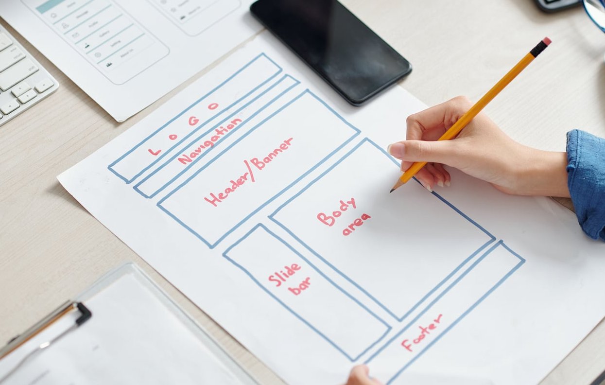
Here is the block order that consistently outperforms, with the purpose of each section and roughly how much vertical space it deserves.
| Block | Job it does | Share of page |
|---|---|---|
| 1. Hero: outcome headline + one line pitch + primary CTA | Qualify in 5 seconds | 10% |
| 2. Problem / “this is for you if” strip | Create recognition | 8% |
| 3. Service blocks (the core) | Explain the offer | 35% |
| 4. Pricing signal or investment range | Filter and reassure | 8% |
| 5. Process in 3 to 5 steps | Reduce perceived risk | 12% |
| 6. Proof: results, testimonials, logos, mini case study | Build trust | 15% |
| 7. FAQ / objection handling | Remove last friction | 7% |
| 8. Closing CTA block | Capture the decision | 5% |
Note the order. Proof comes after the offer, not before. Visitors cannot judge whether your testimonials matter until they understand what you sell.
Step 1: Write the Hero Like a Filter, Not a Banner
The hero of a services page has one sentence to answer “what is this and is it for me”. Use the simple formula:
[Service] for [specific audience] who want [specific outcome].
Examples that work:
- “Shopify design and CRO for DTC brands doing 50k+ per month.”
- “Bookkeeping for construction companies with 5 to 50 employees.”
- “Brand and website packages for B2B SaaS teams launching in under 8 weeks.”
Avoid hero headlines like “Our Services”, “Solutions Tailored to You” or “Excellence in Everything We Do”. They are invisible. Keep the hero image light (or skip it) so the first service block starts before the fold on a laptop.

Step 2: Split Your Offers Into Scannable Blocks
This is where most services page design goes wrong. People dump six paragraphs of prose under one heading. Nobody reads it.
Instead, break every offer into a self contained block with a predictable internal structure. Repetition is good here: once a visitor learns how to read block one, they can scan blocks two to five in seconds.
What every service block must contain
- Service name in plain language. “Paid Search Management”, not “Growth Acceleration Engine”.
- One sentence of positioning. Who it is for and the outcome it produces.
- 3 to 5 deliverables as bullets. Concrete nouns: audit, 12 ad variations, monthly report, dedicated Slack channel.
- A quantified outcome or proof point. “Average 31% reduction in cost per lead in 90 days.”
- A pricing signal. “From 1,800 per month” or “Projects typically 8k to 20k”.
- Timeline or commitment. “4 week sprint” or “3 month minimum”.
- One secondary link. To a dedicated page or a case study, for people who want depth.
Seven elements, 60 to 110 words of copy per block. That is the sweet spot. Anything longer belongs on a dedicated service page.
The description formula that beats generic copy
For each block, write in this order:
- Problem: “Your ads spend is flat but leads are getting more expensive.”
- Mechanism: “We rebuild your account structure around intent, then test offers weekly.”
- Deliverables: the bullet list.
- Outcome: the number or the before and after.
Problem, mechanism, deliverables, outcome. Four lines, no fluff, no “we are passionate about”.
Step 3: Choose a Layout Pattern That Matches Your Offer Count
Pattern A: Single service businesses (deep dive layout)
If you sell one thing, the services page is essentially a long form sales page. Cards and grids hurt you here because they fragment a story that should build momentum.
- Full width alternating sections. Image left / text right, then reversed, 4 to 6 times.
- One section per objection: what it includes, how it works, who it is not for, what it costs, what results look like.
- Sticky CTA bar on desktop and mobile, since the page is long.
- Detailed process timeline with days or weeks attached to each stage.
- One full case study inline, not just a quote.
Target length: 1,200 to 2,000 words of on page copy. Depth is your differentiator because you have no menu to hide behind.
Pattern B: Multi service businesses (hub and spoke layout)
Three or more offers? The services page becomes a hub: it qualifies, summarises, and routes. Each offer gets its own dedicated page (the spoke) with the full depth treatment.
- Grid of 2 or 3 columns on desktop, one column stacked on mobile.
- Identical card height and structure so comparison is effortless.
- Icon or short illustration per card, used for recognition only, never as the main content.
- “Not sure which one?” helper block under the grid, with a 2 question chooser or a comparison table.
- One shared process and proof section below the grid, so you do not repeat yourself.
Rule of thumb: more than six cards and nobody chooses. Group related offers into three or four families instead.
Pattern C: Tiered or packaged services (comparison layout)
If your offers are versions of the same thing (Starter, Growth, Scale), use a comparison table rather than cards. Visitors are not choosing between categories, they are choosing a level.
| Layout pattern | Best for | Primary CTA |
|---|---|---|
| Deep dive (single service) | Specialists, consultants, niche agencies | Book a call |
| Hub and spoke (multi service) | Agencies, clinics, trades, pro services firms | View the service / get a quote |
| Comparison table (tiers) | Productised services, retainers, subscriptions | Start with [tier] |

Step 4: Place Pricing Signals Where They Do the Most Work
“We do not publish prices because every project is different” is the most expensive sentence in professional services. You do not need exact numbers. You need a signal so unqualified visitors self select out and qualified ones relax.
Three levels of pricing signal
- Exact price. Best for productised and fixed scope work. Highest conversion, lowest flexibility.
- Starting from / range. “Websites from 6,500” or “Most engagements land between 3k and 9k per month”. The default choice for 80% of service businesses.
- Qualifying context. “We work best with teams spending 10k+ per month on media.” No number on your side, but a clear budget filter.
Where to put it
- Inside each service block, as a small line under the deliverables. This is the highest impact placement.
- A dedicated “investment” section after the service blocks, before the process, for ranges and what drives price up or down.
- In the FAQ, answering “how much does it cost” directly rather than deflecting.
Never bury pricing only in a downloadable PDF or behind a form. If the number is a secret, the visitor assumes it is bad news.
Step 5: Decide How Many CTAs to Use (and Which Ones)
The common advice “one CTA per page” is misread. It means one CTA action, repeated. Not one button.
For a typical services page, use one primary action repeated 3 to 5 times, plus one low commitment secondary action.
| Position | CTA type | Example label |
|---|---|---|
| Hero | Primary + secondary | “Book a 20 min fit call” / “See pricing” |
| End of each service block | Contextual text link | “See how this works” |
| After pricing | Primary button | “Get a fixed quote” |
| After proof section | Primary button | “Book a 20 min fit call” |
| Page footer block | Primary + fallback | “Book a call” / “Email us instead” |
Three rules for CTA copy on a services page:
- Describe the next step, not the transaction. “Book a 20 min fit call” converts better than “Contact us” because it sets expectations.
- State the commitment. Duration, free, no obligation, response time. Friction is mostly imagined.
- Keep one label everywhere. Five different CTA wordings on one page reads as five different offers.

Common Services Page Mistakes That Make Visitors Bounce
- Leading with your company story. “Founded in 2009, we are a team of passionate…” Nobody is buying your origin yet. Move it to the About page.
- Nine services with equal weight. If everything is a headline, nothing is. Group and prioritise by revenue.
- Icon grids with three word labels. “Strategy. Design. Growth.” means nothing. Visitors cannot buy an abstract noun.
- No pricing signal at all. The top cause of ghosted enquiries and wasted sales calls.
- Carousels for services. Hidden slides are unseen slides, and they are terrible on mobile.
- Testimonials with no name, role or result. “Great service! – J.D.” actively reduces trust.
- A 12 field contact form as the only conversion path. Three fields plus a calendar link outperforms almost every time.
- No internal links to dedicated service pages. You lose both the depth and the SEO coverage.
- Heavy hero video that pushes the first real content below 1,200px and tanks mobile load speed.
- Stock photos of handshakes and skyscrapers. Screenshots of your actual work convert better than any stock library.
Mobile First Details That Change the Numbers
Most services page traffic is mobile, and most services page designs are built on a desktop canvas. Check these before shipping:
- Service cards stack in priority order, not alphabetical or design order.
- Tap targets at least 44px tall, with spacing between buttons.
- Comparison tables become stacked cards or get a horizontal scroll hint.
- A sticky bottom CTA bar appears after the first scroll, not immediately.
- Phone number is a tappable link if calls matter to your business.
- Accordions for the FAQ, open the first one by default.
SEO Notes for Services Pages
A services hub page and individual service pages serve different search intents. Build both:
- Hub page targets your category plus location: “marketing agency in Lyon”, “our services”.
- Spoke pages target the specific intent: “shopify cro audit”, “commercial roof repair”.
- Use descriptive H2s that match how people phrase the service, not internal product names.
- Add Service and FAQPage schema markup where relevant.
- Link from each card to its spoke page with keyword rich anchor text, not “learn more”.
Pre Launch Checklist
- Can a stranger tell what you sell and who it is for in 5 seconds?
- Does every service block have deliverables, a price signal and a timeline?
- Is there one repeated primary CTA with consistent wording?
- Is there at least one proof element with a real name and a real number?
- Are the top three sales objections answered on the page?
- Does the page load in under 2.5 seconds on mobile?
- Is the contact path three fields or fewer, or a direct calendar booking?
- Have you removed every sentence that starts with “We are passionate”?
FAQ
What should a services page include?
At minimum: a headline that names the service and the audience, a short pitch, individual blocks for each offer with deliverables and outcomes, a pricing signal, a 3 to 5 step process, proof (testimonials or case results), an FAQ, and a repeated call to action. Anything beyond that is optional.
How many services should be listed on one page?
Three to six. Beyond six, group them into families and give each family a dedicated page. Choice overload is a real conversion killer on multi service pages.
Should I show prices on my services page?
Show a signal, even if you cannot show an exact price. A “from” figure, a range, or a minimum engagement size filters out poor fit enquiries and increases the quality of the leads that do come through.
How long should a services page be?
A single service deep dive page usually runs 1,200 to 2,000 words. A multi service hub page can work with 600 to 900 words because the depth lives on the individual service pages it links to. Best Service Landing Page Design Examples tackles the same question from another angle.
What is the difference between a services page and a service page?
The services page (plural) is the hub that presents your full range and routes visitors. A service page (singular) covers one offer in depth and is usually the page that ranks and converts for specific search queries.
What are the four P’s of service design?
In the service design discipline, they are People, Process, Products (or props) and Partners: the actors, the sequence of actions, the physical or digital touchpoints, and the external contributors involved in delivering a service. On a web services page, the equivalent translation is: who does the work, how it runs, what you receive, and who you work with.
Do I need a separate page for each service?
If a service has its own search demand, its own buyer or its own pricing logic, yes. Separate pages let you rank for specific queries, run targeted ads to a relevant landing page, and avoid a bloated hub that tries to sell everything to everyone.
Final Word
Strong services page design is mostly discipline: one clear audience, blocks that repeat the same internal structure, an honest pricing signal, and one next step stated the same way every time. Strip out the adjectives, add the numbers, and the page starts doing the job your sales calls were doing for free.