You’ve got a brilliant product or website in the works, but launch day is still weeks (or months) away. So what do you do with that domain in the meantime? Leave it blank? Throw up a default placeholder? Absolutely not. A well-crafted coming soon page is one of the most underrated marketing assets in your arsenal. It can collect thousands of email subscribers, generate buzz on social media, and turn launch day into a real event rather than a quiet whisper.
In this guide, we’ll walk you through everything you need to know about coming soon page design, from the must-have elements to real-world examples that actually convert. Whether you’re launching a SaaS product, an ecommerce store, or a personal portfolio, these tips will help you turn a placeholder into a powerful pre-launch machine.
What Is a Coming Soon Page?
A coming soon page (also called a pre-launch page or teaser page) is a single landing page that goes live before your full website or product is ready. Its job is simple: tell visitors what’s coming, when it’s coming, and give them a reason to stick around until it arrives.
Unlike a full website, a coming soon page has one focused goal. Usually that goal is one of three things:
- Capture email addresses for a launch announcement
- Build social media following and shares
- Generate early signups, pre-orders, or waitlist spots
Why Coming Soon Pages Still Matter in 2026
Some founders skip the pre-launch page entirely, thinking it’s old fashioned. That’s a mistake. Here’s why a strong coming soon page is more valuable than ever:
- You start building an audience before launch day. A list of 500 warm subscribers is worth more than 50,000 cold visitors on day one.
- You claim SEO real estate early. Google starts indexing your domain, your brand keywords, and your basic content months before competitors notice.
- You validate interest cheaply. Email signups are a great signal of demand before you spend on a full launch.
- You create scarcity and exclusivity. Early access, founding member status, and waitlists all build anticipation.
The 7 Essential Elements of a High-Converting Coming Soon Page
Before we get into design styles and inspiration, let’s nail down the core building blocks. Every effective coming soon page should include most of these:
1. A Clear, Bold Headline
Visitors should know within two seconds what’s coming. Don’t be vague or overly clever. “A new way to manage freelance invoices is coming” beats “Something amazing is on the way” every time.
2. A Subheadline That Sells the Benefit
Your headline says what it is. Your subheadline says why it matters. Focus on the outcome your audience cares about.
3. A Countdown Timer
Few design elements create urgency like a ticking clock. Countdown timers tap into FOMO and have been shown to lift conversion rates significantly. Just make sure your launch date is realistic, because nothing kills trust like a timer that hits zero with no launch.
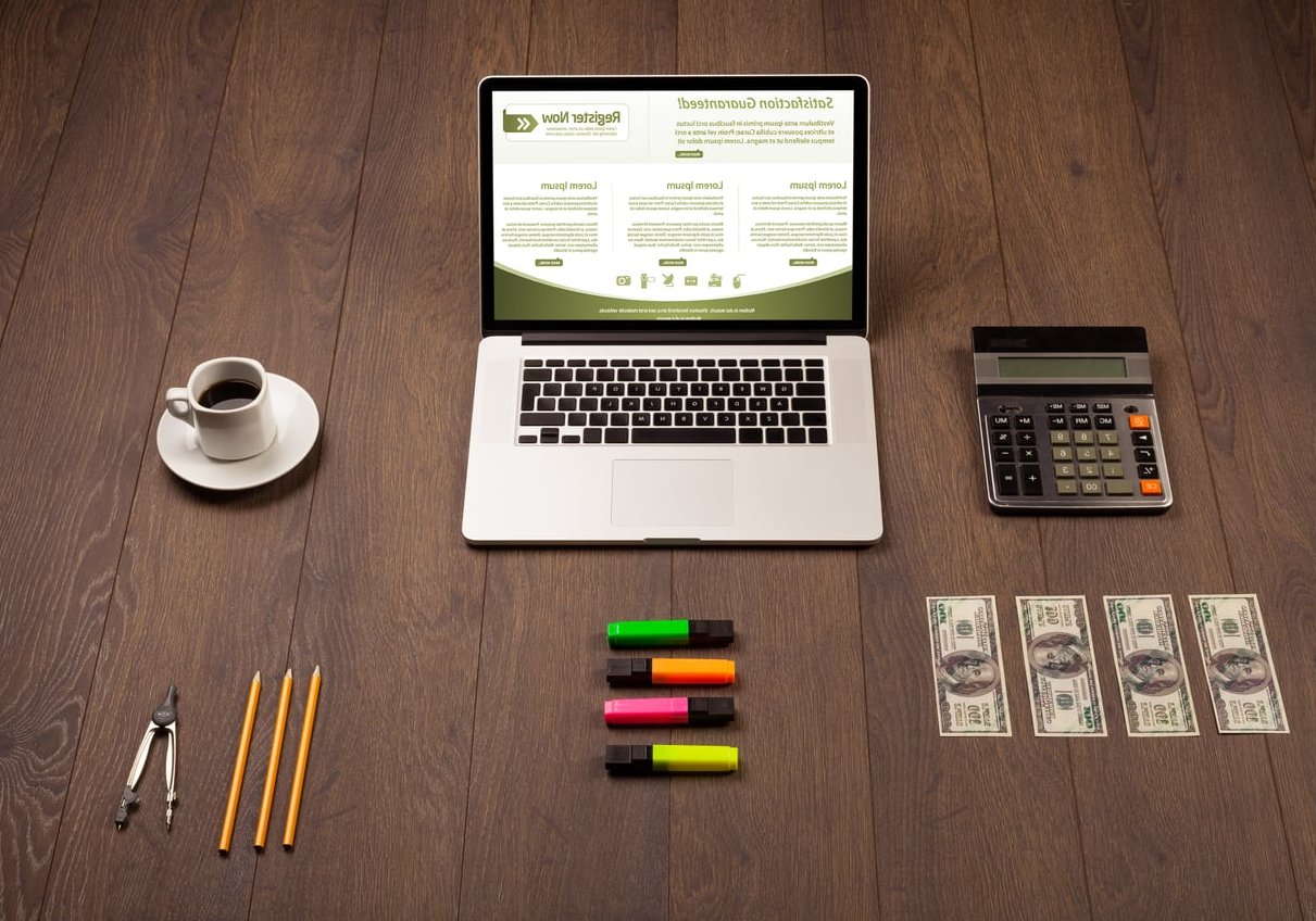
4. An Email Capture Form
This is the heart of your page. Keep it short. One field (email) converts best. If you must ask for more, limit it to two fields max. Place the form above the fold and repeat it lower on the page.
5. Social Media Links
Not everyone wants to give up their email on day one. Social links let those visitors follow you anyway. Display icons for the platforms where you’re actually active, not every social network in existence.
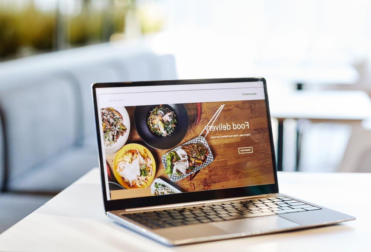
6. A Visual Hook
Your hero image, video, or animation does the heavy lifting of communicating brand personality. Product mockups, behind-the-scenes shots, abstract animations, and lifestyle imagery all work depending on your niche.
7. A Reason to Share
Add a referral incentive or a simple share button. “Refer 3 friends and skip the waitlist” is a classic for a reason. Robinhood famously used this tactic to build a million person waitlist before launch.
Comparison of Coming Soon Page Elements by Goal
| Element | Email Capture Goal | Social Buzz Goal | Pre-Order Goal |
|---|---|---|---|
| Countdown Timer | Recommended | Optional | Essential |
| Email Form | Essential | Optional | Recommended |
| Social Links | Recommended | Essential | Recommended |
| Referral System | Recommended | Essential | Recommended |
| Product Preview | Optional | Recommended | Essential |
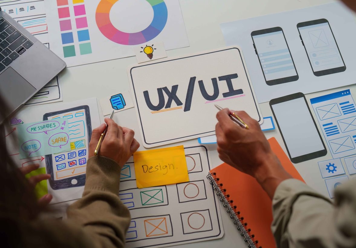
Step-by-Step: How to Design Your Coming Soon Page
- Define your single goal. Are you collecting emails, driving social follows, or capturing pre-orders? Pick one primary objective and design around it.
- Write your copy first. Headline, subheadline, button text. Copy drives design, not the other way around.
- Choose a visual direction. Minimal and typographic, bold and colorful, video-driven, or illustrated. Match it to your brand.
- Build the wireframe. Hero section with headline, form, and visual goes above the fold. Secondary content (about, social proof, FAQ) goes below.
- Add a countdown timer. Use a tool or plugin that auto-updates based on visitor timezone if possible.
- Connect your email form to a CRM or ESP. Mailchimp, ConvertKit, or HubSpot all integrate easily with most page builders.
- Optimize for mobile. Over 60% of your visitors will be on phones. Test the form, the timer, and the buttons on multiple screen sizes.
- Add basic SEO. Title tag, meta description, Open Graph image for social sharing, and a favicon. Don’t skip these.
- Set up analytics. Google Analytics 4 plus a heatmap tool like Hotjar or Microsoft Clarity will show you what’s working.
- Launch and promote. Share on your personal channels, in relevant communities, and through paid ads if budget allows.
Real-World Examples of Great Coming Soon Page Design
The Minimalist Approach
Brands like Superhuman and Linear (in their early days) used ultra-minimal pages with just a logo, one sentence, and an email form. This approach works when your brand or founders already have an audience. The simplicity itself signals confidence.
The Visual Storyteller
Some pre-launch pages lean heavily into video or animated backgrounds to communicate mood. Apple and Tesla product teasers are the gold standard here. If you go this route, make sure your video file is optimized so load times stay under 3 seconds.
The Waitlist Game
Apps like Arc Browser turned their waitlist into an experience, showing your position in line and rewarding referrals with faster access. This gamified approach can multiply your signups by 3 to 5 times compared to a basic email form.
The Sneak Peek
Showing a partial product UI, a blurred screenshot, or a single product photo gives just enough to spark curiosity without revealing everything. Notion and Figma have used this style effectively in past launches.
Common Mistakes to Avoid
- Asking for too much information. Every extra form field cuts your conversion rate. Stick to email only when possible.
- No clear value proposition. “Coming soon” is not a value prop. Tell people what they’re signing up for.
- Slow load times. Heavy background videos and uncompressed images will tank your conversions and your SEO.
- Forgetting to follow up. If you collect 5,000 emails and never email them until launch day, half will forget who you are. Send a welcome email and a few teasers along the way.
- No social proof. Even a simple “Join 2,400 people on the waitlist” counter creates instant credibility.
- Setting a date you can’t hit. If your countdown ends and the product isn’t ready, you’ve burned trust with your earliest fans.

Tools to Build Your Coming Soon Page
You don’t need to code from scratch. Some solid options in 2026:
- Webflow: Best for designers who want full creative control without writing code.
- Carrd: Perfect for one-page sites. Cheap, fast, and surprisingly flexible.
- Framer: Excellent for animated, modern designs with built-in CMS.
- SeedProd (WordPress): If you’re already on WordPress, this plugin gets you live in under an hour.
- Unicorn Platform or Launchaco: Built specifically for SaaS and startup launches.
Frequently Asked Questions
How long should a coming soon page be live before launch?
Anywhere from 4 to 12 weeks is the sweet spot. Less than 4 weeks rarely gives enough time to build a meaningful list. More than 12 weeks risks losing momentum unless you’re actively running campaigns.
Do I really need a countdown timer?
Not always, but only skip it if you’re truly uncertain about your launch date. A countdown that ends with no launch does more damage than no countdown at all.
Can a coming soon page hurt my SEO?
Only if you set it up poorly. Make sure the page is indexable (no noindex tag), has proper meta tags, and includes some real content beyond just “coming soon.” Adding an FAQ or about section helps a lot.
What’s a good conversion rate for a coming soon page?
A well-designed page typically converts between 10% and 25% of visitors into email subscribers. If you’re below 10%, your headline, form placement, or value proposition likely needs work.
Should I run paid ads to my coming soon page?
Only if your cost per email subscriber stays low enough to justify it. Most startups see better results from organic channels (Twitter, Reddit, Product Hunt’s Ship) before turning on paid traffic.
Final Thoughts
A coming soon page is your first impression and your first conversion opportunity rolled into one. Done well, it builds an audience that’s already excited on day one. Done poorly, it’s a missed opportunity that you’ll never get back.
The principles haven’t changed much: clear messaging, focused goals, smart visual design, and a real reason for people to give you their email. Apply the steps above, learn from the examples, and you’ll have a pre-launch page that does more than just hold space. It builds momentum.
Now go build something worth waiting for.