Picking a font sounds like a small decision, but it shapes how visitors feel about your website within seconds. The serif vs sans serif website debate has been running for decades, and with screens getting sharper and design trends shifting fast, the answer in 2026 is not as black and white as it used to be.
In this guide, we break down the real differences between serif and sans-serif fonts for web use, look at how they affect readability, brand perception, and user behavior, and walk through concrete examples so you can choose the right typeface for your project with confidence.
What Are Serif and Sans-Serif Fonts?
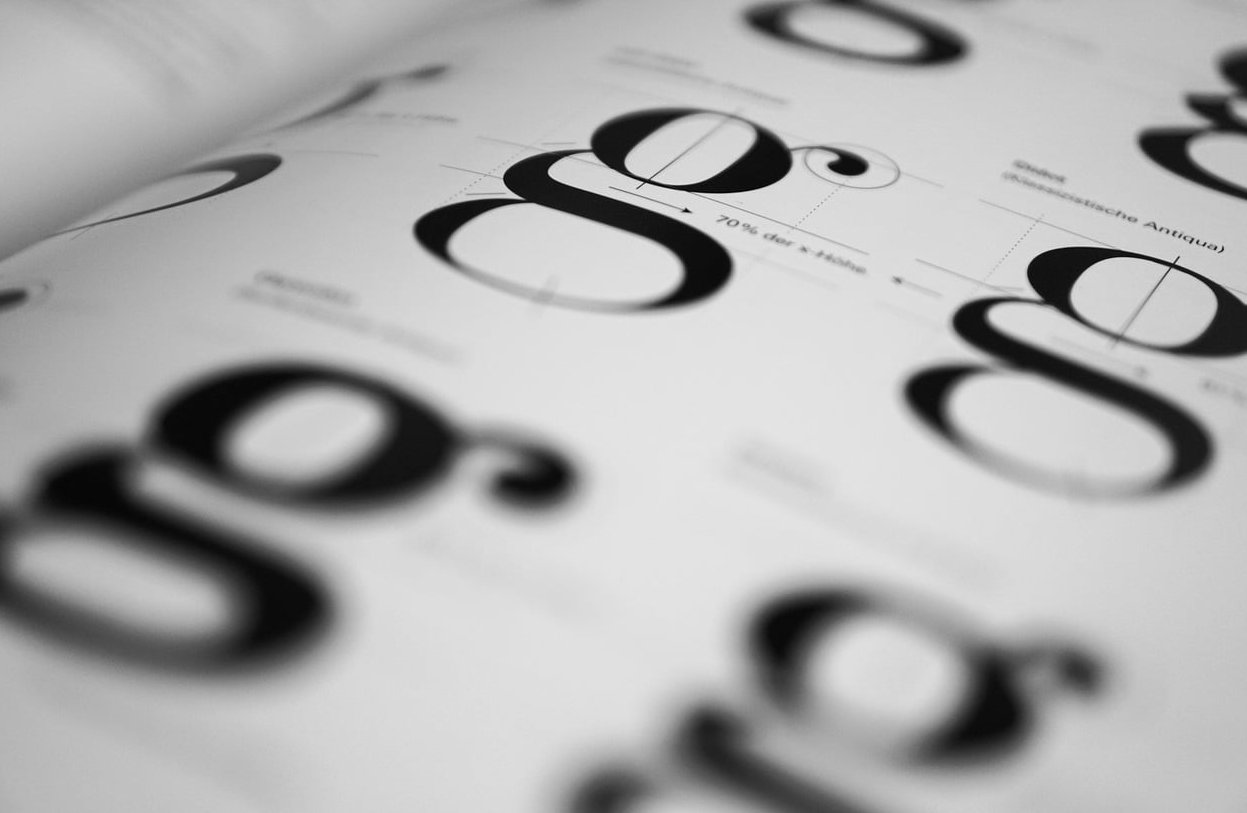
Serif fonts have small decorative strokes (called serifs) at the ends of each letter. Think Times New Roman, Garamond, Playfair Display, or Merriweather. They feel traditional, editorial, and authoritative.
Sans-serif fonts drop those decorative strokes entirely. The word “sans” literally means “without” in French. Helvetica, Arial, Inter, Roboto, and Poppins all fall into this category. They feel clean, modern, and approachable.
Quick Visual Difference
| Feature | Serif | Sans-Serif |
|---|---|---|
| Stroke endings | Decorative feet | Clean, no feet |
| Personality | Classic, trustworthy, refined | Modern, simple, friendly |
| Common use | Print, editorial, luxury | Apps, SaaS, e-commerce |
| Examples | Garamond, Georgia, Lora | Inter, Helvetica, Roboto |
Readability on Screens: What the Research Actually Says
For years, the rule was simple: serif for print, sans-serif for screens. The reasoning was that low-resolution monitors couldn’t render the fine details of serifs cleanly, making them harder to read.
That was true in 2005. It’s mostly outdated now.
With Retina displays, 4K monitors, and high-density mobile screens, modern serif fonts render beautifully. Studies on e-commerce usability (including peer-reviewed research published in 2025) still show a slight edge for sans-serif when it comes to scanning product pages and forms, but the gap is small. What matters far more today is:
- Font size: anything below 16px hurts readability regardless of style
- Line height: 1.5 to 1.7 for body text
- Contrast: dark text on light backgrounds (or vice versa)
- Line length: 50 to 75 characters per line
A well-set serif font at 18px with generous line height will outperform a poorly set sans-serif every time.
Brand Perception: What Each Style Communicates
Serif Fonts Signal
- Heritage and tradition
- Authority and credibility
- Sophistication and luxury
- Editorial weight and depth
This is why publications like The New York Times, Vogue, and The Economist stick with serifs. It’s also why luxury brands like Tiffany & Co. and Rolex lean into them.
Sans-Serif Fonts Signal
- Modernity and innovation
- Simplicity and clarity
- Accessibility and friendliness
- Tech-forward thinking
That’s why almost every major tech company uses sans-serif: Google (Product Sans), Apple (SF Pro), Airbnb (Cereal), Stripe (Sohne), Spotify (Circular).
Real Website Examples
| Website | Font Style | Why It Works |
|---|---|---|
| Medium | Serif (body) | Long-form reading feels editorial and immersive |
| Stripe | Sans-serif | Reinforces clean, technical, developer-friendly image |
| The New Yorker | Serif | Heritage publication, authoritative voice |
| Notion | Sans-serif | Productivity tool, clarity over decoration |
| Aesop | Serif | Luxury skincare, refined and considered |
| Amazon, eBay, Walmart | Sans-serif | High-volume e-commerce, fast scanning |

When to Use Serif Fonts on Your Website
Pick a serif when your brand needs to feel established, premium, or editorial. Specifically:
- Publishing and media: blogs, magazines, newspapers
- Luxury and fashion: high-end retail, jewelry, perfume, haute couture
- Law, finance, and consulting: where authority and trust matter
- Wineries, restaurants, hospitality: when craft and tradition are part of the story
- Personal portfolios for writers, journalists, or academics
When to Use Sans-Serif Fonts on Your Website
Pick a sans-serif when clarity, speed, and modernity matter most:
- SaaS and tech products: dashboards, apps, landing pages
- E-commerce: product listings, checkout flows, mobile-first stores
- Startups: fresh, energetic, forward-looking brands
- Healthcare and education: where accessibility is a priority
- Any site with heavy mobile traffic: smaller screens favor cleaner letterforms
The Hybrid Approach: Pairing Serif and Sans-Serif
You don’t have to pick a side. The most refined websites in 2026 often combine both:
- Serif headlines + sans-serif body: editorial impact with clean readability (used by Apple, Airbnb’s editorial pages, many premium brands)
- Sans-serif headlines + serif body: modern hierarchy with a literary reading experience (used by Medium, Substack)
The 3 font rule is a useful guardrail here: never use more than three different fonts on a single website. Two is usually plenty, one for display, one for body text.
How to Make Your Choice: A Practical Framework
Ask yourself these five questions in order:
- Who is my audience? Younger and tech-native tends to skew sans-serif. Older or premium tends to handle serif well.
- What’s my industry? Match expectations or break them deliberately.
- How much text will users read? Long articles can benefit from a well-chosen serif. Short, scannable content favors sans-serif.
- What’s my brand personality? Heritage and craft, lean serif. Innovation and ease, lean sans-serif.
- Have I tested it? Mock up your homepage in both and look at it on a phone, a laptop, and a large monitor before committing.
Common Mistakes to Avoid
- Using decorative serifs (like Didone styles) for body copy. They look stunning at 60px and unreadable at 16px.
- Picking a font just because a competitor uses it. Your brand has its own story.
- Ignoring web font performance. Heavy font files slow down your site. Use variable fonts and limit weights to what you actually need.
- Forgetting fallback fonts in your CSS stack.
- Choosing a font without testing it in your actual layout, with real content.
Final Verdict: Serif or Sans-Serif for Your Website?
If you want a single rule of thumb: sans-serif is the safer default for most modern websites, especially those focused on conversion, mobile users, or technology. Serif is the smarter choice when your brand depends on heritage, sophistication, or editorial depth.
But the truly best choice is the one that fits your audience, supports your message, and reads beautifully across every device your visitors use. Test it, refine it, and don’t be afraid to mix the two.
FAQ
Is serif or sans-serif better for websites?
Sans-serif is generally easier to scan on screens and is the default for most apps and e-commerce sites. Serif works beautifully for editorial, luxury, and long-form content, especially on high-resolution displays.
What is the 3 font rule?
The 3 font rule says you should never use more than three different fonts on a single website or design. Two is usually ideal: one for headlines and one for body text.
What is the most readable font for a website?
For body text, fonts like Inter, Roboto, and Open Sans (sans-serif) or Georgia, Lora, and Merriweather (serif) consistently rank high for screen readability when set at 16 to 18 pixels with proper line height.
Can I mix serif and sans-serif on the same site?
Yes, and it often produces the most polished result. Use one for headlines and the other for body text to create clear visual hierarchy.
Do serif fonts hurt SEO or page speed?
The font style itself has no SEO impact, but heavy font files can slow your page. Use modern formats like WOFF2, limit the number of weights you load, and consider variable fonts to keep performance high.