
Site search is one of the highest intent interactions on any website. A visitor who types into a search field is telling you exactly what they want. Yet on a lot of sites, that field is a tiny magnifying glass tucked between a language switcher and a cart icon, and the people most ready to convert never find it.
This guide covers search bar design best practices from a pure UX angle: where to place the field, how wide it should be, what the placeholder should say, which icon to use, and how autocomplete should behave. Every recommendation here is about one thing: making search visible and usable instead of buried, so fewer queries get abandoned. Source: https://luigisbox.com.
The short version: 12 search bar design best practices
- Put the search field in the header, near the top right or centre, on every page.
- Show an open input field on desktop, not an icon that expands on click.
- Make the field wide enough for around 27 to 30 characters of visible text.
- Use the standard magnifying glass icon, placed inside or beside the field.
- Keep the input background contrasting with the header so the field reads as a field.
- Write a placeholder that suggests what can be searched, not just the word “Search”.
- Never store important instructions in placeholder text alone.
- Design a visible focus state with a clear border and cursor.
- Trigger autocomplete after two or three characters, with a short delay.
- Cap suggestions at six to ten and highlight the matched substring.
- Keep the query in the field on the results page so users can edit it.
- Design the zero results page as carefully as the results page.

Why small search field decisions change usage rates
Search users behave differently from browsers. They arrive with a specific product, article or answer in mind, they scroll less, and they abandon faster when the path breaks. Three design failures account for most lost queries:
- Invisibility. The field is collapsed behind an icon or pushed below the fold, so users never realise search exists.
- Ambiguity. The field looks like a decorative element, or the placeholder does not tell users what the search covers (products only? blog only? whole site?).
- Dead ends. The query returns nothing, and the page offers no alternative, so the session ends there.
None of these are engineering problems. They are all decisions made in a design file, usually in under an hour, and they set the ceiling for how much value your search engine can ever deliver. See uxcel.com for their take.
1. Placement: put it where eyes already go
Users have a strong learned model of where search lives. Two decades of consistent conventions mean the header is the expected location, and breaking that convention costs you discovery.
Desktop placement
- Top right works for content sites, corporate sites and documentation, where search supports navigation.
- Top centre, full width works for ecommerce, marketplaces and any site where search is the primary navigation method. If more than 30 percent of your sessions include a search, the field deserves centre stage.
- Persistent across pages. A search bar that only exists on the homepage forces users back to the homepage, which is friction with no upside.
- Sticky headers. If your header sticks on scroll, keep search inside it. On long category and article pages this alone lifts usage.
Mobile placement
Screen width forces compromises, but an icon-only approach is acceptable on mobile as long as it follows rules:
- Place the search icon in the top bar, visible without opening the hamburger menu.
- Give it a minimum tap target of 44 by 44 pixels.
- Opening it should reveal a full width field with the keyboard focused and ready, not a second screen requiring another tap.
- On search-driven apps and shops, show a full width input in the header instead of the icon. It costs one row of vertical space and pays for itself.
Placements to avoid
- Inside the hamburger menu only.
- In the footer only.
- In a sidebar below the fold.
- Floating over content in a way that overlaps text on smaller viewports.
2. Width and size: give the query room to breathe
Field width is one of the most underrated levers in search bar UI design. Narrow fields truncate the query, which stops users from proofreading what they typed, and truncated queries correlate with abandoned searches and pogo-sticking back to Google.
| Property | Recommendation | Why |
| Visible characters | 27 to 30 | Covers the vast majority of real queries without truncation |
| Desktop width | 320 to 600 px | Wide enough to read as a primary tool, not a filter |
| Field height | 40 to 56 px | Comfortable click and tap target, aligns with header buttons |
| Font size in input | 16 px minimum | Prevents automatic zoom on iOS and stays legible |
| Mobile width | Full width minus margins | Maximises visible query text on small screens |
If your header is cramped, shrink something else. Search almost always earns more than a secondary nav link.
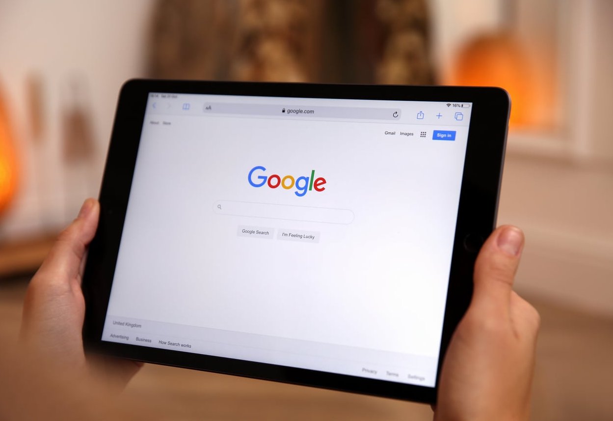
3. Open field versus icon only
The collapsed icon looks clean in a portfolio shot and performs badly in production. On desktop, hiding search behind an icon adds a click before users even know search exists, and it removes the visual cue that made them think of searching in the first place.
- Desktop: show the open field. Always.
- Tablet: show the open field if the header allows it, otherwise a large icon with an instant full width expansion.
- Mobile: icon is acceptable, expansion must be immediate and focused.
One exception: minimal editorial or portfolio sites where search genuinely is a secondary function and analytics confirm low usage. Even then, test before you collapse.
4. Placeholder text that does real work
Placeholder text is free guidance and most sites waste it on the word “Search”. A better placeholder sets the scope of the index and models the kind of query that works.
| Site type | Weak placeholder | Better placeholder |
| Ecommerce | Search | Search products, brands and categories |
| Documentation | Search docs | Search guides, API reference and changelog |
| Help centre | How can we help? | Describe your issue, for example “reset password” |
| Job board | Keyword | Job title, skill or company |
Placeholder rules
- Keep it short enough to fit without truncation at your narrowest breakpoint.
- Use sufficient contrast. Grey on grey at 2:1 fails accessibility and reads as a disabled field.
- Do not put critical instructions in the placeholder, because it disappears on focus.
- Rotating placeholders that cycle through trending queries can help discovery, but keep the animation slow and pause it on focus.
- Question format (“What are you looking for?”) is friendly but less informative than a scope statement. Choose based on whether users need reassurance or guidance.
5. Icon choice and the submit button
The magnifying glass is one of the few truly universal icons. Do not get creative here.
- Use the magnifying glass. Binoculars, arrows and telescopes reduce recognition.
- Angle matters less than clarity. Keep the handle visible and the stroke weight consistent with your other header icons.
- Icon inside the field on the left signals “this is a search input”.
- Icon or button on the right signals “submit”. Both patterns work, just do not use two magnifying glasses in one component.
- Labelled button. A button reading “Search” outperforms an icon-only button for less technical audiences and for ecommerce, where the commitment to submit is higher.
- Clear button. Add an X inside the field once text is entered, especially on mobile where clearing a field manually is tedious.
6. States: hover, focus, active, loading
A search bar has more states than most components, and skipping them is what makes a field feel broken.
- Default: visible border or filled background with at least 3:1 contrast against the header.
- Hover: subtle change in border or background to confirm interactivity.
- Focus: a clear focus ring that is visible for keyboard users, never removed with an outline reset.
- Typing: query text in full contrast, clear button appears, suggestions panel opens below.
- Loading: a small inline spinner if suggestions take more than roughly 300 ms.
- Results page: the query stays in the field, editable and selected on click.

7. Autocomplete behaviour that helps instead of hijacking
Autocomplete is the biggest single upgrade you can make to site search, and also the easiest to get wrong. Good autocomplete reduces typos, shortens the path to results and teaches users what your catalogue contains. A complete guide to search bar design covers this in more depth.
Timing and triggering
- Start suggesting after the second or third character.
- Debounce input by 150 to 250 ms so you are not firing a request per keystroke.
- Target under 100 ms perceived response. Slow suggestions are worse than none because they shift under the cursor.
Content and layout
- Show 6 to 10 suggestions maximum. Longer lists increase scanning cost and get cut off on mobile.
- Bold the part the user has not typed, or highlight the matched substring. Pick one convention and apply it consistently.
- Group suggestions when it helps: query suggestions, then products or pages, then categories. Label each group.
- Include thumbnails and prices for ecommerce. Visual suggestions convert far better than text lists.
- Show recent searches and popular searches when the field is focused but empty. This is a zero effort win for returning users.
Interaction rules
- Arrow keys must move through suggestions, Enter selects, Escape closes and returns focus to the field.
- Never auto-select the first suggestion. Users who type fast and hit Enter should get their own query.
- Do not rewrite what the user typed inside the input while they type.
- Keep the panel aligned to the field width so the relationship is obvious.
- Make each suggestion a full width tap target of at least 44 px on mobile.
8. Results and zero results: where queries die
Discovery gets people to type. What happens after Enter decides whether they stay.
- Keep the query visible in the field and repeat it in a heading such as “14 results for waterproof jacket”.
- Show the result count so users can judge whether to refine or scan.
- Handle typos and synonyms server side, and tell the user when you do: “Showing results for jacket. Search instead for jaket.”
- Zero results should never be a dead end. Offer spelling suggestions, related categories, popular products and a contact or support link.
- Log every zero result query. This list is the cheapest product and content roadmap you will ever get.
9. Accessibility essentials
- Use
<input type="search">inside a<form role="search">. - Provide a real
<label>, visually hidden if the design requires it. Placeholder text is not a label. - Use
aria-expanded,aria-controlsandaria-activedescendanton the combobox pattern for autocomplete. - Announce result counts with a polite live region.
- Maintain 4.5:1 contrast for query text and 3:1 for the field border.
- Support the common shortcut of pressing
/orCtrlplusKto focus search on content-heavy sites, and mention it in the field as a subtle hint.

10. Measuring whether your search bar design works
Design decisions need feedback. Track these five metrics before and after any change to the field.
| Metric | What it tells you | Design lever |
| Search usage rate | Share of sessions using search | Placement, width, open field vs icon |
| Search exit rate | Sessions ending on a results page | Result layout, relevance, zero results page |
| Zero result rate | Queries returning nothing | Placeholder scope, synonyms, autocomplete |
| Abandoned queries | Typing started, never submitted | Suggestion quality, speed, field feedback |
| Search conversion | Value of searchers vs non searchers | Justifies investment in the whole system |
Common search bar mistakes and their fixes
| Mistake | Impact | Fix |
| Icon-only search on desktop | Users do not notice search exists | Expose the full input in the header |
| Field only on the homepage | Forced backtracking, lost sessions | Persist search in the global header |
| Query cleared on results page | Users retype everything to refine | Prefill the input with the submitted query |
| 30 autocomplete suggestions | Choice overload, panel overflows | Cap at 6 to 10, grouped and labelled |
| Blank zero results page | Immediate abandonment | Suggest corrections, categories, support |
| Removed focus outline | Keyboard users get lost | Design a branded, visible focus ring |
A design checklist you can run before shipping
- Can a first time visitor spot search within two seconds on desktop and mobile?
- Is the field present on every template, including article, category and checkout adjacent pages?
- Does a 27 character query fit without truncation?
- Does the placeholder explain what is searchable?
- Does the magnifying glass appear exactly once in the component?
- Do focus, hover and loading states exist in the design file, not just default?
- Do suggestions appear in under 100 ms with the match highlighted?
- Can the whole flow be completed with keyboard only?
- Does the results page repeat the query and the count?
- Does zero results offer at least three next steps?
FAQ
What are the best UX practices for a search bar?
Make it visible in the header on every page, show an open input rather than a collapsed icon on desktop, use a magnifying glass icon, allow around 27 visible characters, write a placeholder that describes the searchable scope, add fast autocomplete limited to 6 to 10 suggestions, keep the query editable on the results page, and design a helpful zero results state.
How to design a search bar step by step?
- Decide the role of search on your site (primary navigation or supporting tool).
- Choose the placement: top centre for search-led sites, top right for content sites.
- Size the field for at least 27 visible characters and a 40 to 56 px height.
- Add the magnifying glass and, where useful, a labelled Search button.
- Write a scoped placeholder.
- Design default, hover, focus, typing, loading and error states.
- Specify autocomplete rules: trigger, debounce, count, grouping, highlighting.
- Design the results and zero results pages.
- Validate keyboard and screen reader flows.
- Instrument analytics and iterate on real queries.
What is the 6-3-1 rule in UI design?
The 6-3-1 rule is a simple constraint for visual consistency: no more than 6 colours, 3 typefaces or type styles, and 1 primary action or focal point per screen. Applied to a search bar, it means the field should use your existing palette, share the header type style, and be the single dominant element in a search-led layout rather than competing with three other calls to action.
What are the 7 golden rules of UI design?
They are commonly summarised as: strive for consistency, provide informative feedback, keep the user in control, prevent errors and support easy recovery, favour recognition over recall, offer shortcuts for frequent users, and reduce visual clutter. A search bar touches all seven, from consistent placement across templates to recognition through recent search suggestions.
Should the search bar be on the left or the right?
Top right is the strongest convention for content and corporate sites because it sits opposite the logo and matches user expectations. Top centre, spanning most of the header width, is better for ecommerce and marketplaces where search drives the majority of navigation.
Is it acceptable to hide the search bar behind an icon?
On mobile, yes, provided the icon is in the top bar and tapping it opens a focused full width field immediately. On desktop, no. Hiding search behind an icon consistently reduces the number of users who notice and use it.
How many autocomplete suggestions should be shown?
Between 6 and 10 for most sites. Fewer feels limited, more creates scanning fatigue and overflows the viewport on mobile. If you mix query suggestions with products or pages, group them under clear labels and keep the total within that range.
Final thought
Search bar design is not decoration. Every one of these choices, from field width to the delay before suggestions appear, changes how many people use search and how many give up midway. Audit your current field against the checklist above, ship the two or three easiest fixes, then let your zero results log tell you what to build next.