
On a phone, your product page is a long scroll. The buy button sits near the top, and the moment a shopper starts reading the description, checking the size chart or scrolling to reviews, that button is gone. A sticky add to cart mobile bar solves that by keeping the primary action permanently within thumb reach.
The problem is that most implementations are copied from an app preset and dropped on the page without any thought about height, contrast, safe areas or what the bar is covering. That is how a feature designed to increase add-to-cart rate ends up hiding a size selector, overlapping a cookie banner or triggering accidental taps that push people back out of the funnel.
This guide is a hands-on walkthrough: when a persistent bar helps, exactly how tall it should be, how to handle price and variants, and the layout patterns used by large retailers. No app roundup, no affiliate list, just the design decisions that move the number. Originally covered on https://thegood.com.
What a sticky add to cart bar actually is
A sticky add to cart bar is a fixed element, usually anchored to the bottom of the viewport on mobile, that keeps the add to cart button (and normally the price and product name) visible while the shopper scrolls the product page. It is sometimes called a sticky cart, a persistent buy bar or a floating add to cart button.
Two formats dominate:
- Bottom bar (recommended for mobile): a full width strip pinned to the bottom edge, inside the natural thumb zone.
- Top bar: a slim strip that docks under the header. It works on desktop, but on mobile it competes with the sticky header and forces an awkward thumb stretch to the top of the screen.
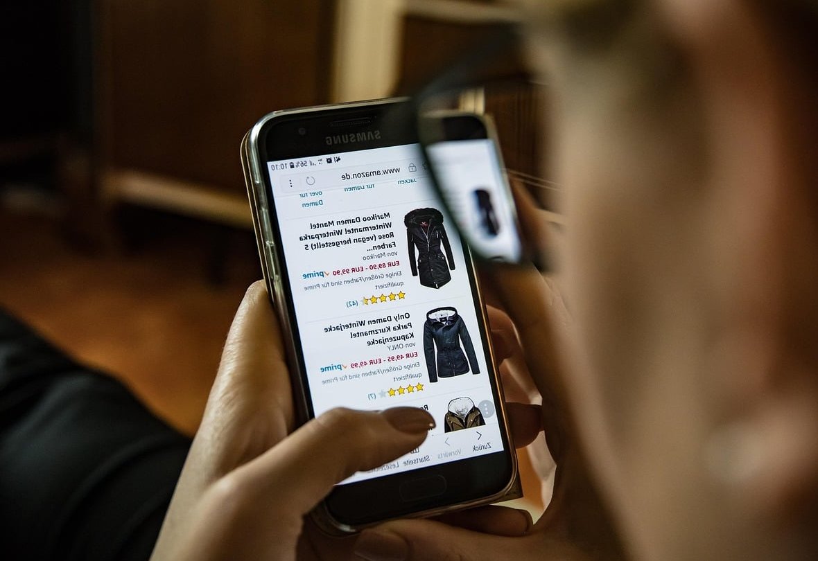
When a sticky add to cart bar helps (and when it hurts)
It is not a universal win. Before building it, check whether your page profile matches.
Good candidates
- Long product pages. If your mobile page is more than roughly two and a half screens tall (rich descriptions, sizing tables, UGC, reviews, cross sells), the buy button disappears fast and a persistent bar pays for itself.
- Simple, low-consideration purchases. Consumables, accessories, single-variant items, refills, replenishment orders.
- Repeat buyers. Customers who already know the product want a shortcut, not a scroll back to the top.
- Heavy review or content sections. The bar catches the shopper at the exact moment the reviews convince them.
Poor candidates
- Short pages that fit in one or two screens. The main button never leaves the viewport for long, so a bar adds clutter and eats vertical space.
- Highly configurable products. Made to measure, engraving, bundles, multi step configurators. A one tap shortcut skips required choices and produces errors.
- Pages that already carry a bottom navigation bar or a persistent chat launcher. Stacking fixed elements at the bottom is how you get accidental taps.
- Very high ticket items where the real job of the page is reassurance, not speed. Test carefully before rolling out.
Placement: the bottom edge, but not exactly the bottom edge
The thumb zone on a modern phone covers roughly the bottom third of the screen, so anchoring the bar there is correct. The mistakes happen at the edges.
Respect the safe area
On iPhones with a home indicator and on Android devices with gesture navigation, the last 20 to 35 pixels of the screen belong to the operating system. A button that sits flush against that zone gets swiped away instead of tapped. Always pad the bar with the safe area inset:
.sticky-atc {
  position: fixed;
  left: 0;
  right: 0;
  bottom: 0;
  padding: 12px 16px calc(12px + env(safe-area-inset-bottom));
  z-index: 60;
}

body.product-page {
  padding-bottom: calc(76px + env(safe-area-inset-bottom));
}
That second rule matters as much as the first. Without bottom padding on the page body, the sticky bar permanently covers the last block of content, which is usually the footer links, a trust badge row or the final cross sell.
Do not stack fixed elements
Decide a hierarchy for everything that wants the bottom of the screen and enforce it in code:
- Cookie or consent banner: highest priority, sticky bar stays hidden underneath or is pushed up while it is open.
- Sticky add to cart bar: visible on product pages only.
- Chat launcher: move it above the bar or hide it on product pages on mobile.
- Back to top button: hide it entirely when the bar is visible.

Height, tap targets and spacing
The bar should be tall enough to tap confidently and short enough to leave the content readable. Here are the numbers that work well on phones in 2026. Someone has put together a good summary of it.
| Element | Recommended value | Why |
|---|---|---|
| Total bar height | 64 to 80 px (plus safe area) | Below 60 px feels cramped, above 90 px steals too much reading space |
| Primary button height | 48 to 52 px | Meets the 44 px iOS and 48 dp Android minimum tap target |
| Button width | 55 to 100% of bar width | The action must be visually dominant, never a small pill in a corner |
| Price font size | 16 to 18 px, semibold | Readable at arm’s length without zooming |
| Product thumbnail (optional) | 40 to 48 px square | Confirms which variant is selected without a text label |
| Horizontal padding | 16 px | Matches the page gutter so the bar does not look bolted on |
| Gap between tappable items | Minimum 8 px | Prevents mis-taps between quantity, variant and add to cart |
| Appearance animation | 150 to 250 ms slide or fade | Fast enough to feel instant, slow enough to be noticed |
When should the bar appear?
A bar that is visible from the first pixel of the page is redundant, because the real add to cart button is already on screen. Two buy buttons at once split attention and look like a bug.
The clean rule: show the sticky bar only once the primary add to cart button has scrolled out of view, and hide it again when the shopper scrolls back up to it. An IntersectionObserver on the main button is cheaper and smoother than a scroll listener:
const mainBtn = document.querySelector('#product-form-submit');
const bar = document.querySelector('.sticky-atc');

new IntersectionObserver(([entry]) => {
  bar.classList.toggle('is-visible', !entry.isIntersecting);
}, { threshold: 0 }).observe(mainBtn);
Two extra rules worth adding:
- Hide the bar over the footer. Once the shopper reaches newsletter signup and legal links, the buy intent moment has passed and the bar just blocks links.
- Hide it when a drawer, modal or size guide is open. Nothing looks more broken than a buy bar floating on top of a size chart overlay.
Price visibility: never hide the number
A sticky bar without a price forces the shopper to scroll back up to check what they are about to commit to, which defeats the entire purpose. Include the price, and follow these rules:
- Show the price of the selected variant, updated live. A bar showing the “from” price while a more expensive size is selected creates a mismatch at checkout and destroys trust.
- Show the compare-at price next to the current one when the item is discounted, in a smaller, struck-through style. It is one of the cheapest conversion levers on the bar.
- Include quantity in the total if you keep a quantity selector in the bar, or leave quantity out entirely and show the unit price.
- Do not add taxes, shipping estimates or countdown timers. The bar has room for one number and one action.
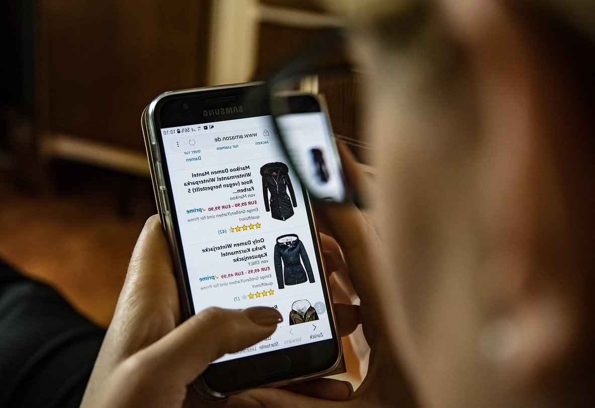
Layout patterns from real e-commerce product pages
Four patterns cover almost every store you will find in the wild. Pick based on how many variants your catalogue has.
Pattern A: full width button only
A single edge to edge button reading “Add to cart” with the price inside it, for example “Add to cart, 39.00 EUR”. Used by single-variant brands and subscription boxes.
- Pros: largest possible tap target, zero ambiguity, fastest to build.
- Cons: no room for variant context, so only use it when there is nothing to choose.
Pattern B: thumbnail plus price plus button
A 44 px product image on the left, name and price stacked in the middle, button on the right at about 40 to 50% width. This is the most common layout on beauty and home goods stores.
- Pros: confirms the exact variant visually, feels like a mini product card.
- Cons: product names get truncated on small screens, so limit to one line with ellipsis.
Pattern C: variant chip plus button (the apparel pattern)
The bar shows a compact selector like “Size: M” as a tappable chip next to the add to cart button. Tapping the chip opens a bottom drawer with sizes, tapping the button adds the selected size.
- Pros: handles the number one reason mobile add-to-cart fails on apparel, which is size not selected.
- Cons: needs proper state handling. If no size is selected yet, the button must open the size drawer instead of throwing an error.
Pattern D: dual action bar
Add to cart as a secondary outlined button plus an express checkout button (wallet payment) as the primary. Common on high volume stores with strong mobile wallet adoption.
- Pros: can shorten the funnel dramatically for returning wallet users.
- Cons: two competing actions in a 70 px strip. Only run it if your analytics show meaningful wallet usage, and keep the two buttons visually distinct.
Avoiding accidental taps
Accidental taps are the hidden cost of a badly built sticky bar. They add unwanted items, trigger cart drawers mid-scroll and make people bounce.
- Keep an inert margin. Give the bar a background and at least 8 px of non-tappable padding around the button so an edge tap does nothing.
- Never make the whole bar clickable. Only the button and the variant chip should react to taps.
- Disable the button during the request. Show a spinner or a “Adding” state so a double tap does not add two units.
- Do not open the cart drawer automatically on every add if your bar is easy to hit. A small confirmation toast plus a cart count badge is less disruptive and easier to recover from.
- Give the bar an opaque background with a subtle top border or shadow. Transparent and blurred bars look elegant but blend into product photography, which is when people tap without meaning to.
- Test with the on-screen keyboard open. When a shopper types in a review search or a gift note field, a fixed bar can jump over the keyboard on some Android browsers. Hide it on input focus.
Common mistakes that hurt checkout rates
- Covering the size guide, variant swatches or quantity selector. The bar must never sit on top of a control the shopper needs before deciding.
- Showing it from the top of the page, creating two identical buttons on screen.
- Ignoring out of stock states. If the selected variant is unavailable, the bar should say “Sold out” or “Notify me”, not stay green and clickable.
- Using a different label than the main button. “Buy now” in the bar and “Add to cart” in the page suggests two different outcomes.
- Low contrast. Any button below a 4.5:1 contrast ratio against its background fails on a sunlit phone screen.
- Layout shift. A bar that appears without reserved space pushes content and hurts your Cumulative Layout Shift score. Use a fixed position element, not an inserted block.
- Deploying it on every template. Collection pages, blog posts and the cart do not need a buy bar.
- Skipping validation. Adding to cart without a required variant produces a broken cart line and a support ticket.
- Heavy third party scripts. If your bar is injected by an app that loads after everything else, it flickers in late and slows the page. A theme-level implementation is almost always faster.

How to measure whether it works
Do not judge the bar on add-to-cart rate alone. It is easy to raise add-to-cart and lower revenue at the same time, because a frictionless button collects hesitant and accidental adds that never convert.
Track this set together:
| Metric | What it tells you |
|---|---|
| Mobile product page to add-to-cart rate | The headline effect of the bar |
| Add-to-cart to checkout initiation rate | Whether the extra adds are real intent or noise |
| Cart line removals | A spike usually means accidental taps |
| Rage taps and dead clicks on the bar | Broken states, slow responses or unclear affordance |
| Scroll depth on the product page | Whether the bar is stopping people from reading key content |
| Revenue per mobile session | The only number that settles the argument |
Run the test for at least two full business cycles so weekday and weekend behaviour are both represented, and segment new versus returning visitors. Returning buyers usually show the biggest lift.
A build checklist
- Bar appears only after the main add to cart button leaves the viewport.
- Bottom padding added to the page body so nothing is permanently covered.
env(safe-area-inset-bottom)applied for gesture navigation devices.- Button at least 48 px tall with a clear, opaque background.
- Live variant price, with compare-at price when discounted.
- Variant state visible, with a tap that opens the selector when nothing is chosen.
- Out of stock, adding and added states all designed.
- Hidden when a modal, drawer, cookie banner or keyboard is open.
- Hidden over the footer.
- No conflict with chat widgets or bottom navigation.
- Contrast checked, screen reader label set, focus order preserved.
- Tested on a small screen device, a large one, iOS and Android.
FAQ
Does a sticky add to cart bar actually increase conversions on mobile?
On long product pages it reliably increases add-to-cart rate, because the action is always one thumb tap away. Whether it increases revenue depends on execution: if it hides content, produces accidental taps or skips variant selection, the extra adds do not survive to checkout. Always validate with revenue per session, not add-to-cart alone.
Should the bar be at the top or the bottom on mobile?
Bottom. It sits in the natural thumb zone, it does not fight with a sticky header, and it matches the interaction pattern of native shopping apps. Top bars make more sense on desktop, where the cursor moves freely and the header area is already the navigation anchor.
How tall should a sticky add to cart bar be?
Around 64 to 80 pixels of content height, plus the device safe area inset. The button itself should be at least 48 pixels tall. Anything taller than roughly 90 pixels starts to eat a noticeable share of a small screen.
Should I include a quantity selector in the bar?
Usually not. Quantity belongs to the main product form. Adding a stepper to the bar shrinks the button, creates two more small tap targets next to it and raises the mis-tap rate. The exception is consumables and refills, where multi-unit ordering is the norm.
Should the sticky bar use “Add to cart” or “Buy now”?
Use the same label as your main product button so the outcome is predictable. If you want an express path, add a separate wallet checkout button rather than changing the wording, and keep the two visually distinct.
Do I need an app to add a sticky add to cart bar?
No. Most modern themes on Shopify, WooCommerce and headless setups can implement it with a fixed element and an IntersectionObserver. An app is convenient when you need no-code control or advanced targeting, but a theme-level build is normally lighter, faster and easier to style so it matches the rest of your product page.
Should the bar show on desktop too?
It can, but the design is different. On desktop, keep the buy module in the right column sticky as the page scrolls instead of pinning a bar to the bottom of the window, which feels like a mobile pattern misplaced on a large screen.
Key takeaway
A sticky add to cart bar is not a growth hack you switch on, it is a piece of interface design with real constraints: a fixed height budget, a safe area, a hierarchy of other fixed elements and a variant state to keep in sync. Get the trigger point, the price display and the tap targets right, keep the bar out of the way of anything the shopper still needs to read, and it becomes one of the highest-return changes you can make to a mobile product page.