
Most fitness studios do not lose members because of their programming. They lose them on the website, somewhere between the homepage and the booking form. A visitor lands, scrolls, cannot find the class schedule, sees a pricing page that hides the numbers, and leaves for the gym two blocks away that made it easy.
This guide is a practical breakdown of gym website design from a conversion angle. Not a gallery of pretty screenshots, but the pages, layouts, booking flows and photo direction that get a stranger to book a trial session or a tour. Every recommendation below is tied to one measurable outcome: a booked appointment.
First, define the one action your gym website must produce
A gym website has exactly one primary job. It is not to display your brand values or list your equipment. It is to convert a visitor into a booked trial, a free class, a tour or a consultation.
Before designing a single screen, pick your primary conversion and rank the rest:
- Primary: book a free trial class, a first session or a facility tour.
- Secondary: join online directly (for self serve memberships and drop in passes).
- Tertiary: capture an email or phone number (schedule PDF, intro offer, waiting list).
- Micro: call, WhatsApp, or get directions (high intent, mobile heavy).
Everything else on the site, including your Instagram feed and your trainer bios, exists only to support one of those four actions. If a section does not push a visitor toward booking, it either gets cut or gets moved below the fold.
The three questions every visitor asks in the first 8 seconds
- What kind of gym is this? CrossFit box, boutique reformer studio, 24/7 access gym, boxing club, personal training space.
- Is it for someone like me? Beginner friendly or competitive, women only or mixed, budget or premium.
- What does it cost and how do I try it? Price range and the exact next step.
If your hero section answers all three without a scroll, your conversion rate goes up before you change anything else.

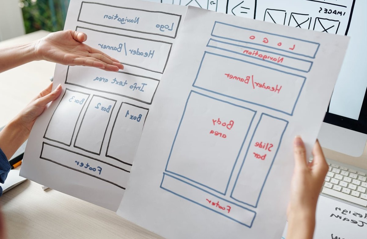
The page architecture a fitness studio actually needs
Bigger sitemaps do not convert better. A focused eight to twelve page site outperforms a thirty page site almost every time, because every extra page is a chance to leave the booking path.
| Page | Conversion job | Must contain |
|---|---|---|
| Homepage | Qualify and route to the trial | Hero with offer, proof, schedule preview, pricing teaser, location, CTA repeated 4 to 6 times |
| Class schedule / timetable | Answer “can I fit this into my week” | Live weekly grid, filters, spots left, book button on every row |
| Memberships and pricing | Remove price anxiety | Real prices, 3 tiers max, contract terms, freeze and cancellation policy |
| Free trial / intro offer | Convert the decided visitor | Short form or embedded booking calendar, what to expect, no navigation distractions |
| Classes / programs (one page per signature program) | Capture specific search intent | Who it is for, intensity level, duration, coach, times, CTA |
| Coaches and team | Build trust and reduce intimidation | Real photos, certifications, specialties, a human line about them |
| Facility / tour | Sell the environment | Gallery of the real space, changing rooms, parking, opening hours |
| Contact and location | Close local searches | Map, address, phone with click to call, hours, transport and parking notes |
| Results and reviews | Social proof | Member stories with names and photos, video testimonials, review widgets |
| FAQ | Kill last minute objections | Beginner questions, contracts, showers, what to bring, age limits |
Add a blog only if someone will actually maintain it. A stale blog with three posts from 2023 makes a gym look closed.
Homepage layout: the section order that converts
Order matters more than aesthetics. Here is the sequence we use for studio and gym builds, top to bottom. envato.com makes the same point with more data.
1. Hero: offer, not slogan
Replace “Unleash your potential” with something a stranger can act on. A high converting gym hero contains:
- Headline with category and location: “Strength and conditioning coaching in Brooklyn Heights”.
- Subline with the promise and the audience: “Small group classes capped at 12, built for beginners and returning lifters.”
- Primary button: “Book your free trial class”. One dominant color, high contrast.
- Secondary link: “See this week’s schedule” or “Book a tour”.
- Trust strip: star rating and review count, years in business, member count.
Background: a short muted looping video or a single strong photo. If you use video, keep it under 6 seconds, under 2 MB, and always serve a static image on mobile so your load speed does not collapse.
2. Who it is for (the qualifier band)
Three or four cards that route by intent: New to training, Getting back in shape, Competing athlete, Personal training. Each card links to the relevant program page. This single band reduces bounce because visitors self identify instantly.
3. Schedule preview
Show today and tomorrow’s classes with times and spots remaining, then a link to the full timetable. Real time data is the most underused conversion asset a gym has. Seeing “6:30 PM HIIT, 4 spots left” creates urgency no copywriting can match.
4. Proof block
Two or three member quotes with faces and first names, plus your Google rating. Avoid the anonymous “John D., member”. Real names and real photos convert measurably better.
5. Pricing teaser
Show the starting price and the intro offer on the homepage. Hiding it forces a click and loses the price sensitive visitor who would have converted at your actual rate.
6. Facility and location
Photos of the real space, opening hours, map, parking and transit. For a local business, this is a conversion section, not a formality.
7. Final CTA band
Full width, single action, no competing links: “Try a class free this week. Pick your time.” Then the calendar or button. Background reading: https://joinzipper.com.

Class schedule design: the page that makes or breaks the booking
The timetable is usually the second most visited page on a gym site and the most frequently botched. Common failures: a downloadable PDF, an image of a spreadsheet, an unstyled third party iframe that breaks on mobile, or a schedule that requires login to view.
What a converting timetable looks like
- Default to today, not to Monday. Most visitors check the schedule to see if they can come tonight.
- Mobile view is a vertical list, grouped by day, not a squeezed seven column grid. Desktop can keep the grid.
- Filters that matter: class type, coach, level, time of day (morning, midday, evening).
- Every row shows: time, class name, coach, duration, level, spots remaining, and a Book button.
- Color code by class type with a visible legend, and never rely on color alone (add a label so it stays accessible).
- Waitlist option on full classes instead of a dead end.
- Trial nudge inline: a persistent line above the grid saying “First class free. Choose any session marked Open Level.”
Handling booking software that looks ugly
Most gyms run Mindbody, Wodify, Glofox, Zen Planner, Kilo or a similar platform. Their embeds rarely match a custom design. Three options, in order of preference:
- API driven custom schedule: pull class data via the platform API and render it in your own design. Best experience, highest build cost.
- Styled embed: keep the widget but override fonts, colors, button styles and spacing so it feels native. Good compromise.
- Hand off at the last step: display a beautiful read only schedule on your site and send the visitor to the platform only for payment and account creation. Acceptable if the visual jump is softened by matching colors and a reassuring line of copy.
Whichever you pick, test the full flow on a phone with one hand. If it needs pinch and zoom, it is losing you members.
Membership pricing blocks that reduce hesitation
Price transparency is a conversion tactic, not a risk. Visitors who cannot find prices assume the worst and leave. Visitors who see prices either self qualify out (saving your team time) or move forward already comfortable.
Structure the tiers, do not list everything
Three tiers is the sweet spot. Four is the maximum. Beyond that, the page becomes a comparison exercise and comparison delays decisions.
| Element | Why it converts |
|---|---|
| Highlighted “Most popular” tier | Anchors the decision and lifts average revenue per member |
| Monthly / annual toggle with savings shown | Pushes longer commitments without pressure |
| Price per session calculated for you | Reframes 149 per month as 12 per class |
| Contract terms stated plainly | Cancellation and freeze rules are the number one hidden objection |
| Joining fee shown or explicitly waived | Prevents drop off at the payment step |
| Trial CTA under the table | Catches the visitor who is not ready to commit today |
| Short FAQ below the tiers | Handles objections at the exact moment they appear |
For personal training or semi private coaching where prices are genuinely variable, do not go silent. Publish a range (“Programs start at 220 per month”) and make the CTA “Book a free consultation”. A range still filters and still builds trust.
Small details that lift pricing page performance
- Use plain names: Off Peak, Unlimited, Unlimited Plus. Not Bronze, Silver, Gold.
- Keep the feature list to five or six lines per card. Move the rest to a comparison table below.
- On mobile, stack cards with the recommended tier first, not in the middle.
- Add a money back or cancel anytime guarantee if you can honor it. It is the single strongest risk reducer on a pricing page.
- Repeat the CTA at the bottom of every card, not once at the end of the section.

Trial sign up CTAs: wording, placement and flow
The trial is your conversion event. Design it like a product, not like a form.
Wording
Specific beats generic. Compare:
| Weak CTA | Stronger CTA |
|---|---|
| Sign up | Book my free trial class |
| Learn more | See this week’s schedule |
| Contact us | Book a 10 minute tour |
| Get started | Claim the 3 class intro pass |
Add a micro reassurance line under the button: “No card required. Takes 40 seconds.” It routinely lifts click through.
Placement
- Hero: primary button, above the fold.
- Sticky header: one button, always visible on desktop.
- Mobile sticky bar: two thumb sized actions at the bottom, typically “Book trial” and “Call”.
- After every proof section: conviction peaks right after a testimonial.
- End of the schedule and pricing pages: the two highest intent moments on the site.
- Exit intent on desktop: optional, and only with a real offer.
The booking flow itself
Every additional field costs you conversions. A trial booking should be:
- Step 1: pick a class or a time slot from a visual calendar.
- Step 2: name, email, mobile. Three fields. That is it.
- Step 3: confirmation screen with the date, the address, a map link, what to bring, and an add to calendar button.
Then automate: an instant confirmation email, an SMS reminder the day before, and a short note from the coach who will meet them. Goals, injuries, fitness level and emergency contact belong in a follow up form or the in person intake, not in the first conversion step.
Reduce no shows by design
- Show the coach’s photo and name on the confirmation screen.
- Include a “what to expect in your first class” section with parking, arrival time and dress code.
- Offer one click reschedule instead of forcing a cancellation.
Photo and video direction: the biggest visual lever
Photography does more for a gym website than any layout decision. Stock images of models in an empty white studio actively hurt trust, because visitors know that is not your gym. This article covers the same ground in more depth.
The shot list every studio should own
- Hero shot: wide angle of the real floor during a busy class, natural light, motion in the frame.
- Coaching moment: a coach adjusting a member’s form. This is the single most persuasive image type for beginner conversion.
- Real member faces: a range of ages and body types, ideally your actual community.
- Detail textures: chalked hands, barbell knurling, reformer springs, gloves, sweat on the floor. Great for section dividers.
- The entrance: the street facing view so first timers recognize the door.
- Changing rooms, showers, lockers: a decisive factor for commuters and a top objection for women in particular.
- Coach portraits: consistent lighting and background across the whole team.
- Short vertical clips: 6 to 10 seconds, usable on the site and repurposed for social.
Technical direction
- Pick one grade and apply it everywhere: warm and bright for wellness and pilates studios, high contrast and darker for strength and combat gyms.
- Shoot with negative space on one side so headlines have somewhere to sit.
- Serve WebP or AVIF, lazy load anything below the fold, and keep hero images under 250 KB.
- Give every image a descriptive alt attribute. It helps accessibility and image search.
- Get written photo releases from members before you publish faces.
Mobile, speed and accessibility
The majority of gym website traffic is mobile, and a large share arrives from Google Maps, Instagram bios or a friend’s text message. Build mobile first and design the desktop version after.
- Tap targets of at least 44 by 44 pixels, with real spacing between them.
- Click to call in the header, not buried on the contact page.
- Address as a tappable maps link everywhere it appears.
- Under 2.5 seconds for Largest Contentful Paint on 4G. Compress video, defer third party scripts, and load booking widgets only when they enter the viewport.
- Contrast ratio of at least 4.5:1 for body text. Dark gym aesthetics frequently fail this.
- Keyboard navigable schedule and forms, with visible focus states.

Local SEO essentials baked into the design
A gym site competes locally, so structure supports rankings:
- A dedicated page per location for multi site operators, with unique copy, photos, staff and schedule.
- LocalBusiness or ExerciseGym schema markup with hours, geo coordinates, price range and review data.
- Identical name, address and phone formatting across the site, Google Business Profile and directories.
- Program pages targeting real searches: “beginner boxing classes in [city]”, “reformer pilates [neighborhood]”.
- A visible opening hours block in the footer, including holiday variations.
- Embedded Google reviews on the homepage and pricing page.
Measure what matters after launch
A redesign without measurement is decoration. Track these from day one:
| Metric | Healthy benchmark for a local gym site |
|---|---|
| Visitor to trial booking rate | 3 to 8 percent |
| Booking form completion rate | Above 60 percent once started |
| Schedule page views per session | High views with low bookings signals a broken flow |
| Trial to member conversion | 30 to 60 percent depending on model |
| Mobile bounce on homepage | Below 55 percent |
Add event tracking on every CTA, record sessions to watch where people hesitate, and run one test at a time: CTA wording, pricing layout, hero image, form length. In that order, since those deliver the largest swings.
Nine mistakes that quietly kill gym website conversions
- A PDF or JPG class schedule.
- Hidden pricing with a “contact us for rates” wall.
- An auto playing hero video with sound.
- Stock photography that does not match the real space.
- A booking form asking for date of birth, goals and emergency contact at step one.
- A menu with twelve items and no visible primary button.
- No mention of parking, showers or what to bring.
- Contact forms that go to an unmonitored inbox instead of the front desk phone.
- No follow up sequence after a trial booking, so half the bookings never show up.
Launch checklist
- Primary CTA visible on every page without scrolling on mobile
- Live, filterable, mobile friendly schedule
- Real prices published with clear contract terms
- Trial booking under 60 seconds and three fields
- Original photography of the actual space and members
- Google reviews or testimonials on the homepage and pricing page
- LocalBusiness schema, correct NAP, embedded map
- Hero under 250 KB, LCP under 2.5 seconds on mobile
- Automated confirmation email plus SMS reminder
- Analytics events on every CTA and booking step
FAQ: gym website design
How much should a gym website cost?
A polished template build with a styled booking integration typically lands in the low thousands. A custom design with an API driven schedule, multi location pages and conversion tracking usually sits considerably higher. The right question is payback: if your average member is worth 900 over their lifetime, a site that adds four members a month pays for itself very quickly.
Should I use a template or a custom design?
Templates are fine for a single location studio with a straightforward offer, provided you replace every stock photo and rebuild the schedule and pricing sections around your booking software. Custom becomes worth it when you have multiple locations, a complex program mix, or you are spending meaningfully on ads and every point of conversion rate matters.
Do I need to show prices on my gym website?
Yes in almost every case. Hidden pricing filters out serious buyers along with the tire kickers. If your pricing is genuinely custom, publish a starting range and lead with a free consultation instead.
What is the best booking flow for a fitness studio?
Pick a time from a visual calendar, enter three fields, land on a confirmation screen with the address and what to bring. Anything longer belongs in a follow up. Keep the visitor on your own domain for as long as possible and only hand off to the booking platform for payment if you have to.
How many pages does a gym website need?
Eight to twelve for most single location studios: home, schedule, pricing, trial, two or three program pages, coaches, facility, contact and FAQ. Add one location page per site if you operate several.
What should the homepage hero say?
Your gym type, your city or neighborhood, who it is for, and one clear button to book a trial. Save the motivational slogan for the wall of the studio.
How often should a gym website be redesigned?
A full redesign every three to four years is a reasonable rhythm, but continuous improvement matters more. Refresh photography annually, revisit pricing blocks whenever rates change, and test CTA wording every quarter.
Turn your website into your best sales rep
Great gym website design is not about looking like a fitness brand from a mood board. It is about removing every point of friction between a curious visitor and a booked trial: a schedule they can read on the train, prices they can trust, a form that takes 40 seconds, and photos that show the real place they will walk into.
Audit your current site against the checklist above. If more than three items are missing, you are almost certainly leaving members on the table every single week.