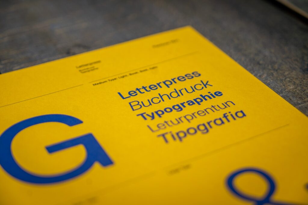
In the realm of web design, typography is not merely a choice of fonts; it’s a crucial element that shapes user experience, communication, and the aesthetic appeal of a website. This article explores the art of typography in web design, focusing on tips for readability and style.
Understanding the Impact of Typography
The primary role of typography in web design is to communicate information effectively. Good typography guides users through content, making the journey both engaging and effortless. It’s not just about what you say but how it’s presented.
1. Choosing the Right Font
Selecting the right font is foundational in typography. Serif fonts, like Times New Roman, are often used for more traditional or formal content, while sans-serif fonts like Arial offer a modern, clean look. Consider the character of your website and content when choosing a font. Tools like Google Fonts provide a vast array of options.
2. Readability is Key
Readability is paramount. Ensure your text is easily scannable by using a font size that is comfortable to read on various devices. A general rule is to set body text to at least 16px. Line length is also crucial; aim for 50-75 characters per line for optimal readability.
3. Effective Use of Hierarchy
Using different font sizes, weights, and styles creates a visual hierarchy that guides the reader’s eye. Headlines, subheadings, and body text should be distinct and well-organized. This hierarchy helps users quickly understand the structure and importance of the content.
4. Color and Contrast
The color of your text and its background significantly affects readability. High contrast, such as black text on a white background, is typically most readable. However, softer contrasts can be used for a more subtle aesthetic, as long as it doesn’t hinder readability.
5. Consistency is Crucial
Maintain consistency in your typography. Using too many different fonts or styles can be jarring and confusing. Stick to a limited selection of fonts and apply them consistently across your website.
6. Responsive Typography
With the variety of devices used to access websites, responsive typography is essential. Your type should look good and be readable on any screen size. This might mean adjusting font sizes, line heights, and spacing for different devices.
7. White Space and Alignment
White space, or negative space, is a powerful tool in typography. It helps in making content more digestible and less overwhelming. Similarly, text alignment (left, right, center, or justified) can significantly affect the readability and appearance of your text.
8. Pay Attention to Line Height and Letter Spacing
Line height (line spacing) and letter spacing (tracking) can greatly affect how text is perceived. Adequate spacing makes text more legible and aesthetically pleasing.
9. Incorporate Personality with Typographic Pairings
Pairing fonts can add personality and depth to your design. For instance, a serif headline with a sans-serif body text can create an appealing contrast. Be cautious with pairing, as conflicting styles can be distracting.
10. Test and Iterate
Finally, always test your typographic choices. What looks good in theory may not work in practice. Get feedback, observe how users interact with your content, and be willing to iterate and improve.
Conclusion
Typography in web design is an art that marries functionality with style. By focusing on readability, creating a visual hierarchy, maintaining consistency, and experimenting with styles and pairings, designers can create websites that not only communicate effectively but also leave a lasting impression. Remember, typography is not just about seeing the words; it’s about feeling and understanding them.