
Blog

How to Design a Hero Section That Grabs Attention: Tips and Examples
The hero section is the first thing visitors see when they land on your website. You have roughly three seconds to communicate who you are, what you...

How to Use White Space in Web Design to Improve Readability and Focus
Ever landed on a website that felt cluttered, overwhelming, or just plain hard to read? Chances are, it was suffering from a lack of white space. On...

How to Design a Real Estate Website That Generates Leads: Best Practices
In a market where buyers start their property search online before ever calling an agent, your website is your most important salesperson. Great...

How to Design a Testimonial Section That Builds Trust: Layouts and Examples
Your homepage has three seconds to convince a visitor you're worth their time. A well crafted testimonial section design is one of the fastest ways...
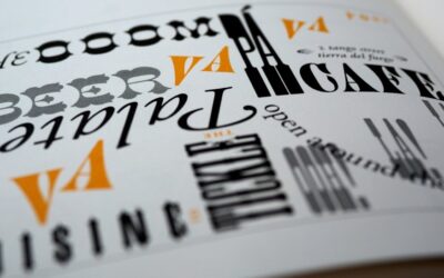
Serif vs Sans-Serif Fonts for Websites: Which Should You Use?
Picking a font sounds like a small decision, but it shapes how visitors feel about your website within seconds. The serif vs sans serif website...

How to Design a Coming Soon Page That Builds Hype: Tips and Examples
You've got a brilliant product or website in the works, but launch day is still weeks (or months) away. So what do you do with that domain in the...

Infinite Scroll vs Pagination: Which Is Better for Your Website?
Infinite Scroll vs Pagination: The Debate That Still Matters If you are building or redesigning a website in 2026, one of the most impactful UX...

Web Design for Dentists: How to Build a Website That Gets New Patients
Why Web Design for Dentists Is Different From Any Other Industry Your dental practice website is not just a digital brochure. It is your most...

How to Create a Responsive Masonry Grid Layout with CSS
Why Masonry Layouts Still Dominate Modern Web Design If you have ever scrolled through Pinterest, Unsplash, or Dribbble, you have seen a masonry...

How to Design a Careers Page That Attracts Top Talent: Best Practices and Examples
Why Your Careers Page Design Matters More Than You Think Your careers page is often the first real impression a potential hire has of your company....

Accordion vs Tabs: Which UI Pattern Is Better for Organizing Content?
Accordion vs Tabs: The UX Showdown You Need to Settle If you have ever designed a content-heavy page, you have probably faced this question: should...

How to Add a Dark Mode Toggle to Your Website with CSS and JavaScript
Why Every Website Needs a Dark Mode Toggle in 2026 Dark mode is no longer a nice-to-have feature. Users expect it. Whether they are browsing late at...
Search
Recent Posts
How to Design a Sign Up Page That Maximizes Conversions
Your sign up page is the single most important conversion point in your entire product funnel. Get...
Radio Buttons vs Checkboxes: When to Use Each in Web Forms
If you've ever paused while designing a form and wondered whether to use radio buttons or...
Radio Buttons vs Toggle Switches: Which Should You Use in Web Forms?
Choosing between a toggle switch and a radio button seems like a tiny UI decision, but it has a...
Radial Menu Design: When to Use Circular Navigation on Websites
Menus are the backbone of any interface, yet most websites default to the same horizontal bar or...
Toast Notification Design: Best Practices for Non-Intrusive User Feedback
Toast Notification Design: The Complete Practical Guide Toast notifications are the quiet...